The biggest asset any menu designer has is that, more often than not, when people enter a restaurant they want to eat. They’re hungry, famished, starving, in need of delicious sustenance to keep them going and to combat that ill-tempered, impatient groggy persona hiding deep within their subconscious.
They want food – and they’ll often want a lot of it. So how do you create an opportunity for success and profit in such a situation? Easy – use the delicious world of food and color psychology.
Psychology and Marketing
Psychology is essential in food marketing. As Malcolm Gladwell argued, people will choose what the marketing tells them to choose, rather than what they actually want. Call it peer-pressure, aspiration or manipulation, it’s the truth.
As the Toast Lab cites, there are several distinct menu design choices that are important to influencing choice. A green design suggests fresher food, while items in the middle of the menu are looked at first, whereas the first two food choices are most often ordered. All these things have to be taken into consideration when developing your menu.
Another thing to take advantage of is the burden of choice. People will take longer to order the more responsibility their choice comes with – which is why family or platter meals are more commonly ordered when appropriate, because these alleviate a lot of the burden of choice from possible diners.
Wordplay Helps
To ensure that diners are beginning to become mouth-wateringly hungry before they even get their orders into the kitchen, utilize the right adjectives. When describing a tomato pesto dish, “a playful twist on the Italian classic, made with sun-dried tomatoes, perfectly ripened olives and a sprinkle of well-aged Lombardy parmesan,” will bring better results than “the world’s best tomato pesto, served with olives, capers and parmesan.”
Alternatively, a minimalistic approach often works fine as well, as it gives readers the incentive to fill in the details for themselves.
Next, the layout matters. Utilizing price anchors – that is, placing the most profitable dish next to the most expensive similar food item – will create the illusion of a bargain in the diner’s mind, and will result in more orders of the profitable dish. Prioritizing the dish itself over the cost of the dish in the design will lead diners to choose after their stomach rather than their wallet’s tastes, as they’re not immediately visually directed towards an item’s price.
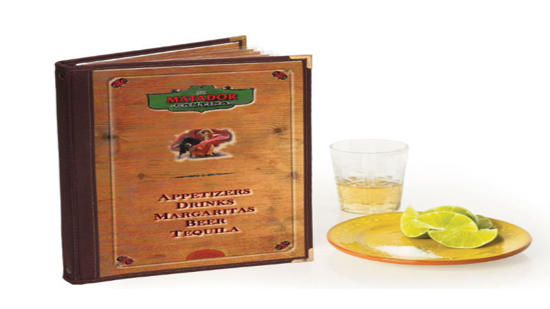
Finally, the physical aspects of the menu itself has to come into careful consideration. Leatherette menu covers can be quite stylish, for example. Don’t rely on cheap menus; a great menu is an important investment.


